Mark It
Mark It is a conceptual app which allows dog owners to easily find dog friendly places to go with their pets. This was created to help ease the dog’s separation anxiety and the dog owner’s feeling of guilt.
My Role: UX/UI Designer
Tools: Adobe Photoshop, Sketch, Invision
Problem
Being a dog owner is both extremely rewarding and yet challenging. A few difficulties include: costs, traveling, finding dog friendly restaurants, training, spending enough time with the dog and feeling guilty for leaving their dog at home. Mark It could be a beneficial app that would alleviate these stressors from the owner.
Goal
Relieve the dogs’ separation anxiety and the dog owner’s feeling of guilty.
“Hemsworth suffers from separation anxiety and acts up when I leave him home along for too long”
— Allison
Research
I interviewed young professionals around Downtown Los Angeles who were walking their dogs after work.
All the dogs suffer from separation anxiety before or currently
Owners use different methods to cope with separation anxiety
Dogs are walked once a day or more
Dogs can be unattended up to 9 hours at a time
Dog owners feel very guilty for leaving their best friend at home
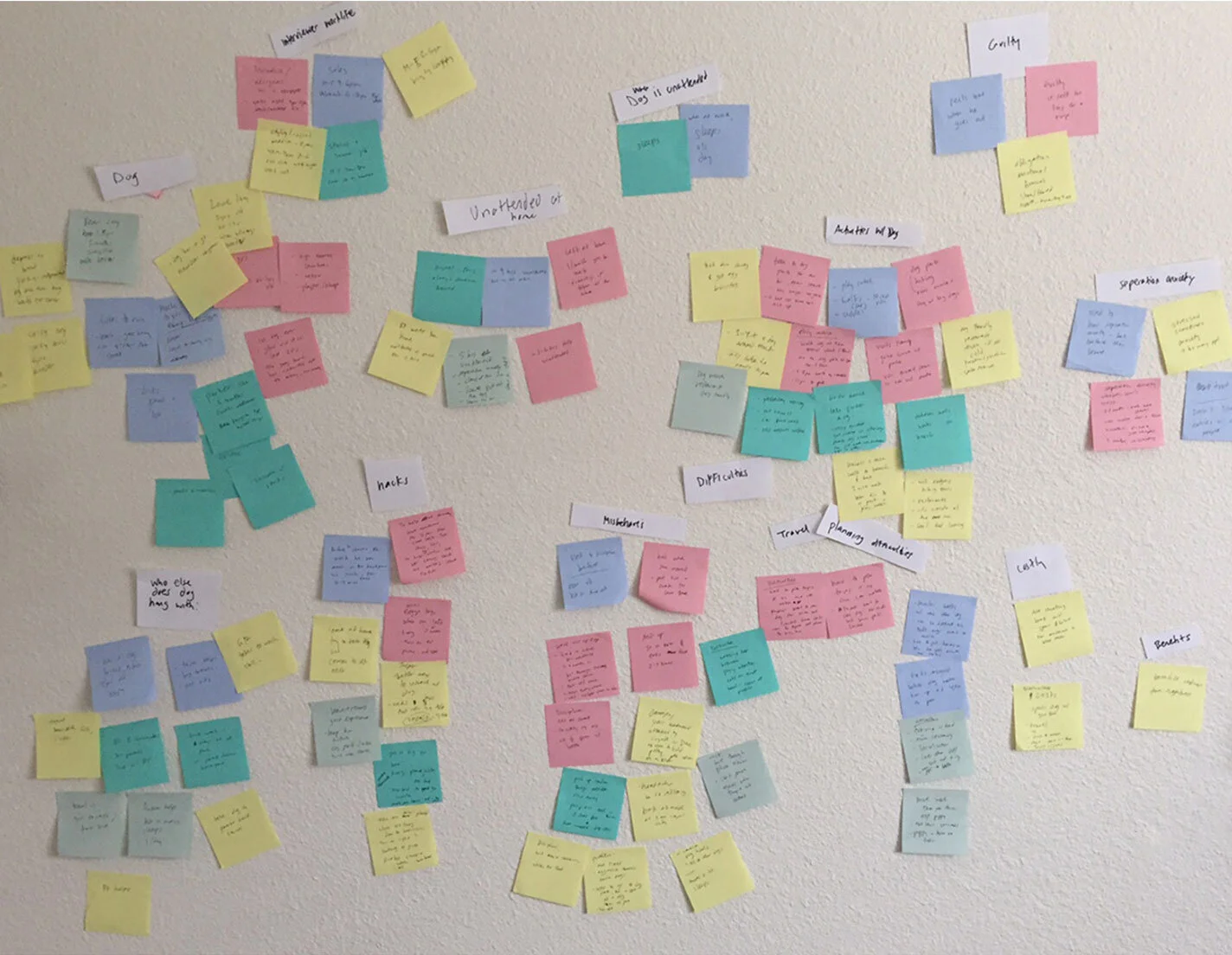
After creating an affinity map from the interview notes, I found myself drawn to the word, “guilt”. My focus was to find a solution for more quality time opportunities between both owner and dog.
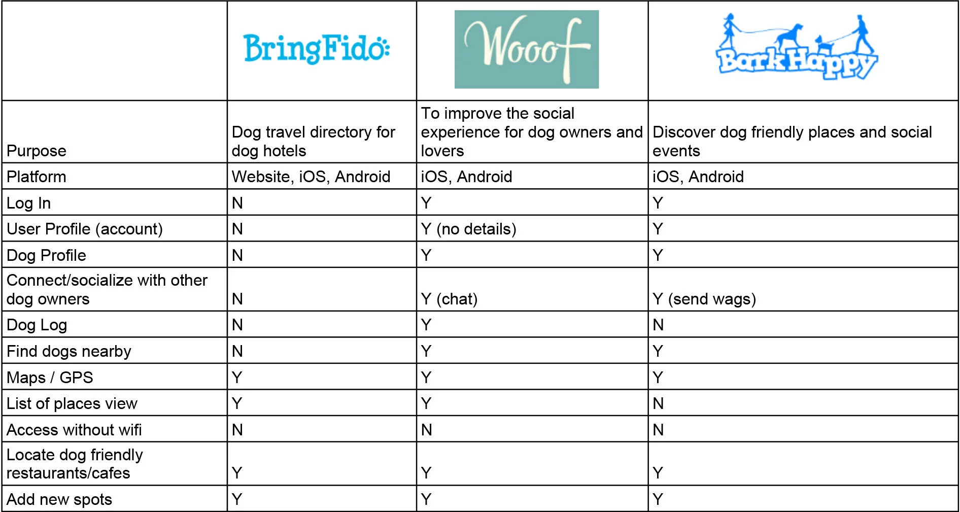
From researching the competitors, dog friendly resources were scarce. The websites either lacked useful information or were inactive. BringFido started off as a travel directory for dog hotels, but expanded to restaurants. This website was the best resource I could find, however I had to read through an abundance of reviews in order to figure out how dog friendly a place was.
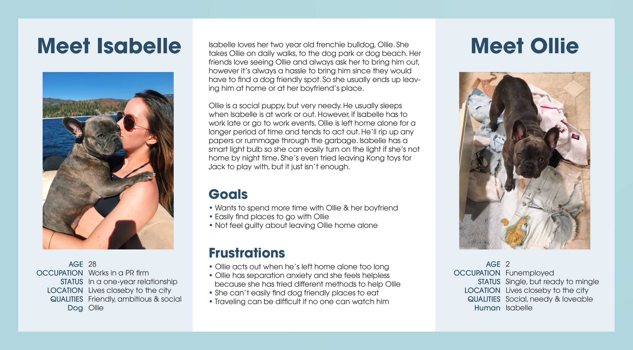
I constructed a user persona for both the dog owner and pet to help navigate and empathize through the rest of the design process.
Design Process
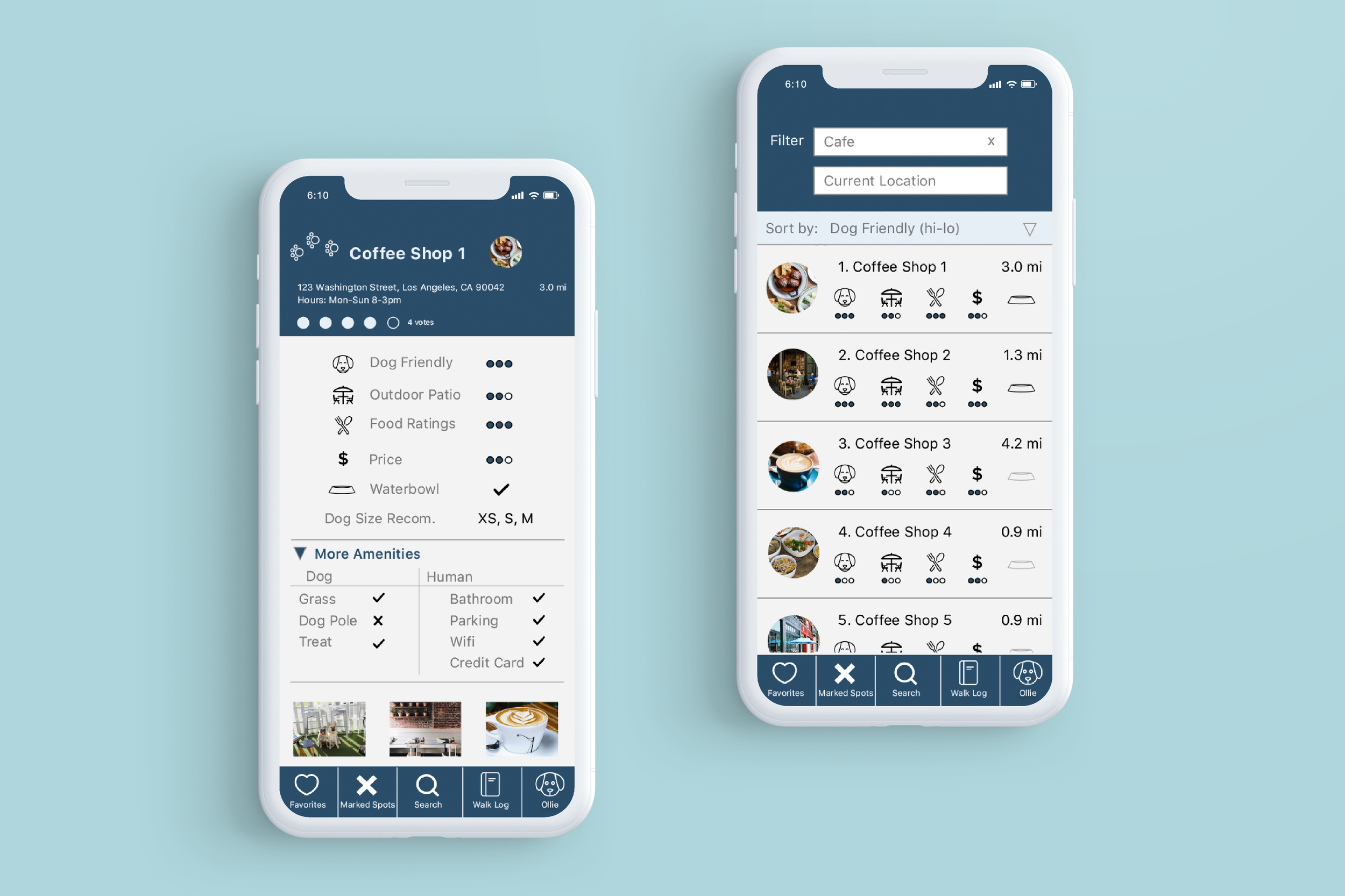
To figure out what information was important to users, the card sorting technique was utilized to create a list of amenities that could possibly shown on the app. The most crucial details users wanted to know was how dog friendly a location was, as well as food ratings and price.
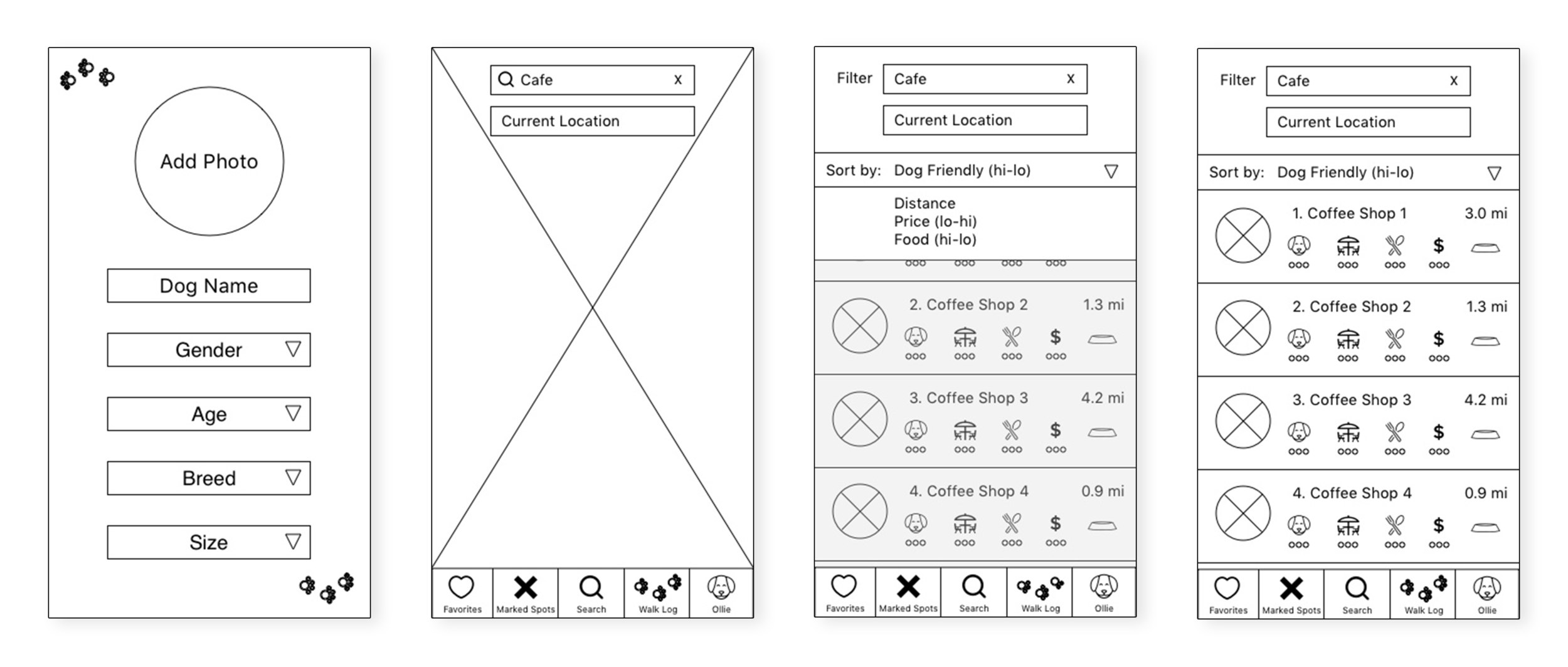
After usability testing for the paper prototype, the people liked the concept. However they were confused by the functionality of the app. They also overlooked a few features because it seemed cluttered. From these learnings, I created low fidelity wireframes which resulted in a smoother usability testing since it was cleaner.
With the higher fidelity mockups, users were able to get a better understanding of the app and easily found dog friendly spots. The rating system made it easy to locate places to hang out with their dog. Although, there was a bit of confusion with where the directory was coming from since it was not clearly conveyed to the user that they could add new locations.
Conclusion
My biggest discovery was that plenty of early usability testing was vital. Rushing into the low and high fidelity mockups too early caused time wasted when I should have focused on the path and experience for the user. Iterating the designs with a nicer sketch would have been much more efficient. Secondly, the simpler, the better. The initial design had too many options within the navigation and amenities list, especially since users would need to fill out this information. With some more iterations and simplifying, this app would a useful resource for dog owners to find a place to hang out with their best friends.
