DAILYLOOK Checkout Redesign
DAILYLOOK is a premium styling service that delivers a curated box of women's clothing to the client's home based on her style preferences, fit and lifestyle. Once she receives the box and decides what to purchase, she must checkout online to let us know what she'd like to keep and return.
My Role: As the UX designer, I worked closely with the Product Manager to discuss deliverables and execute the project in a timely manner. I created the mockups for the checkout process for desktop, mobile web and mobile app, conducted user testing and assisted with QA once the product was on beta and production.
Tools: Adobe Photoshop, Invision
Team: Shari Staine, Product Manager
Jason Unterbrink, Front End Web Developer
David Parod, Lead Front End Developer
Derek Justus, Lead Mobile Developer
Problem
Clients would complain that the checkout process was very long, cumbersome and unclear. Sometimes clients weren’t able to figure out how to checkout and would have to contact client services or would not checkout and get automatically charged for all the items. Also, the user interface was inconsistent between all devices, which was confusing if the user switched to a different platform to checkout.
Goal
The goal was to update the user experience of the checkout process so it would be quicker and simpler while still providing sufficient information for the Styling Team and Merchandising Team. For a more seamless transition between platforms, the user interface should be more consistent.
“Your checkout process sucks. You shouldn’t force someone to fill in every little button.”
— DAILYLOOK Client A
“The checkout process is so lengthy that I actually wanted to keep everything rather than fill 47 radio boxes to tell you what I thought about each item.”
— DAILYLOOK Client B
“We have to type a book for each one of these. Checking out is a pain”
— DAILYLOOK Client C
Research
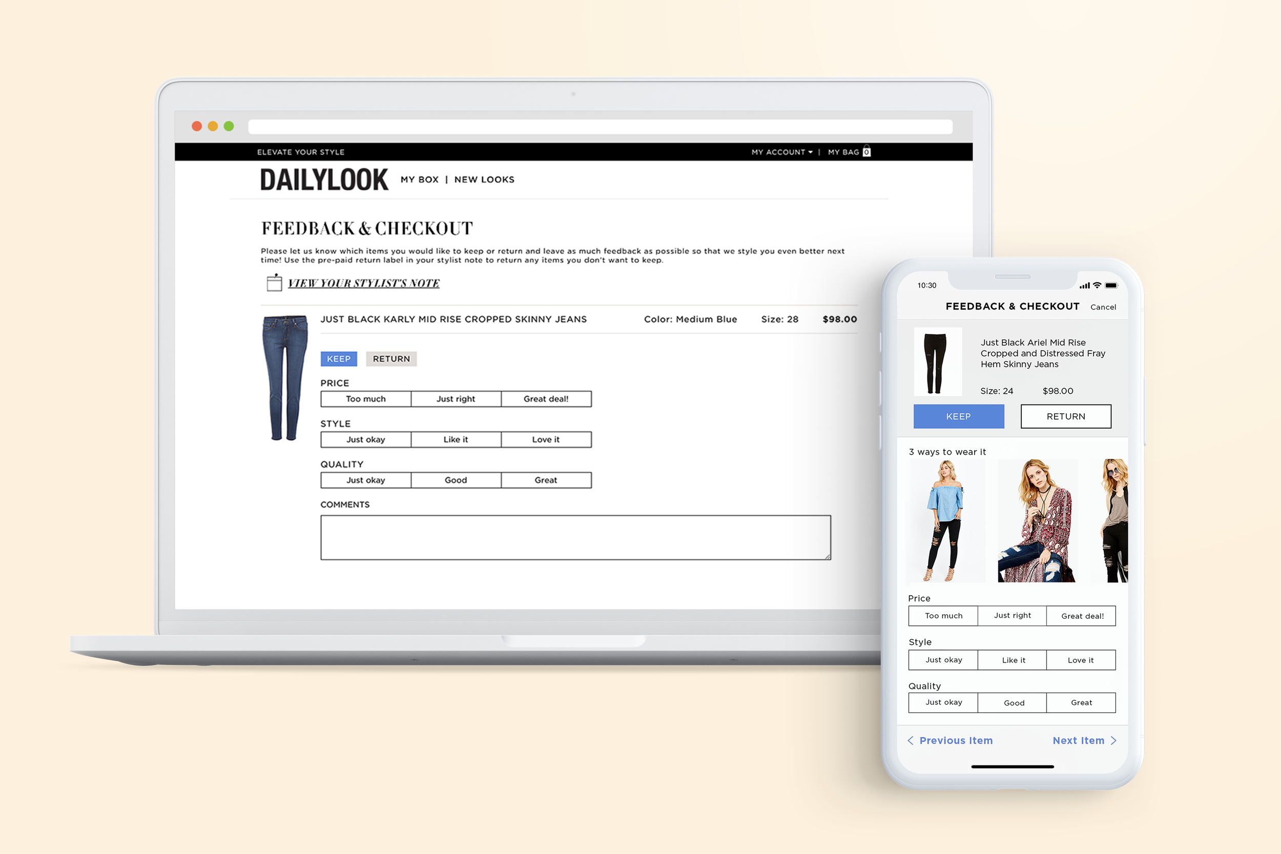
There were three different platforms that the client can use to complete checkout. Below were the requirements for each platform:
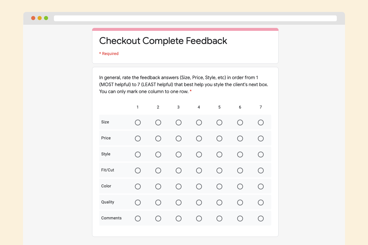
Desktop: We asked 6 feedback questions (Size, Price, Style, Fit/Cut, Color, Quality) per item, 3 questions were required to answer per item
Mobile Web: We asked 4 feedback questions per item, 1 question was required to answer per item
App (iOS): We asked 4 feedback questions per item, 1 question was required to answer per item
Each box contains 7-12 items, which means the client would have to answer 21-36 feedback questions whether she kept an item or not. The asterisk next to the feedback questions indicated that the question was required, however there were no clear instructions explaining this on the website.
We sent different surveys to our external (clients) and internal (Styling Team and Merchandising Team) stakeholders to determine what feedback was important to know. Clients valued providing feedback first and then having a shorter checkout. From our competitive analysis data, we found that our competitors like Stitch Fix or Trunk Club didn’t require clients to leave any feedback when checking out.
Key Takeaways
On all platforms, we reduced the number of feedback questions and asked different feedback questions depending if the client kept or returned an item. Additionally we updated the user interface for all platforms to be more consistent and on brand.
Updated checkout requirements for Desktop/Mobile Web/App:
Kept item: We asked 3 feedback questions per item and it was all optional.
Returned item: We asked 5 feedback questions per item and at least 1 reason was required reason to proceed to checkout.
Design Process
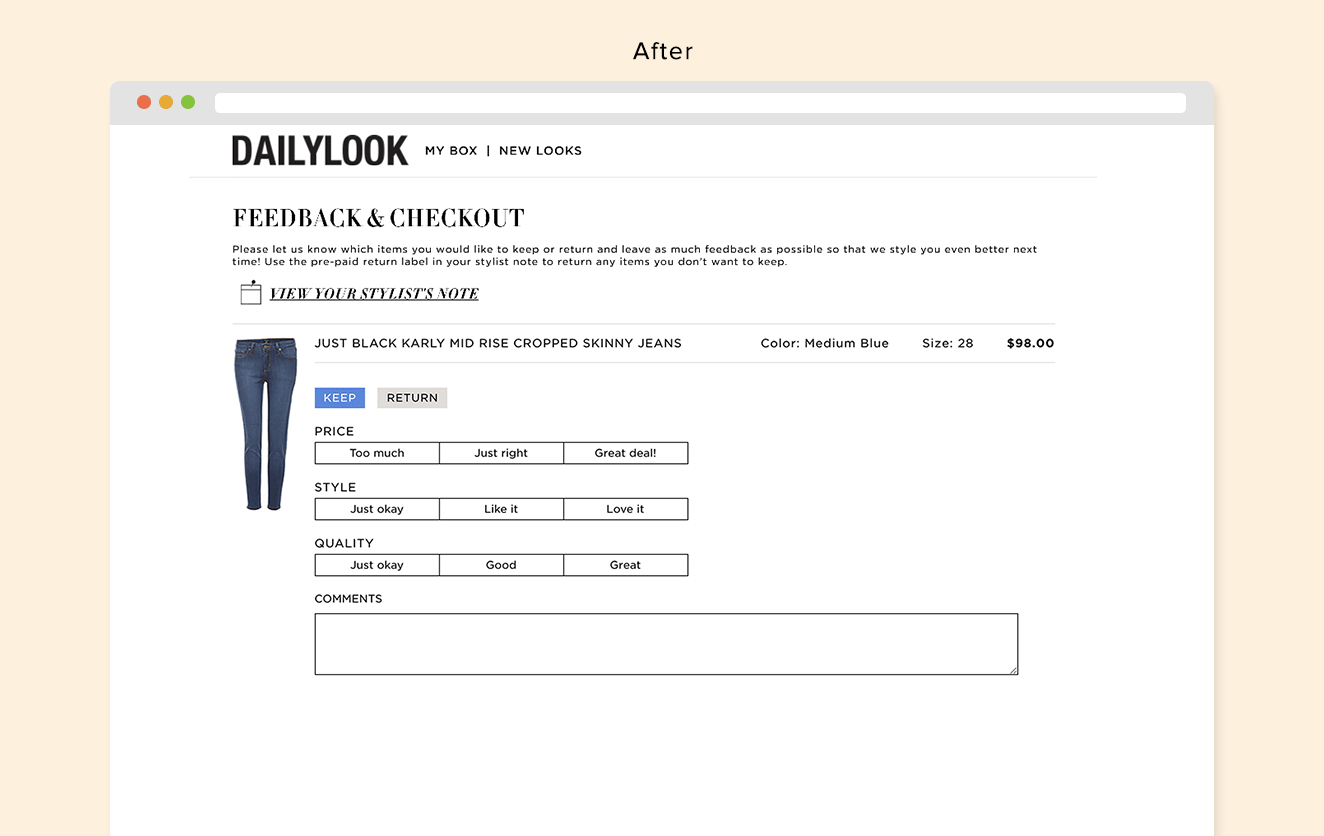
Desktop & Mobile Web
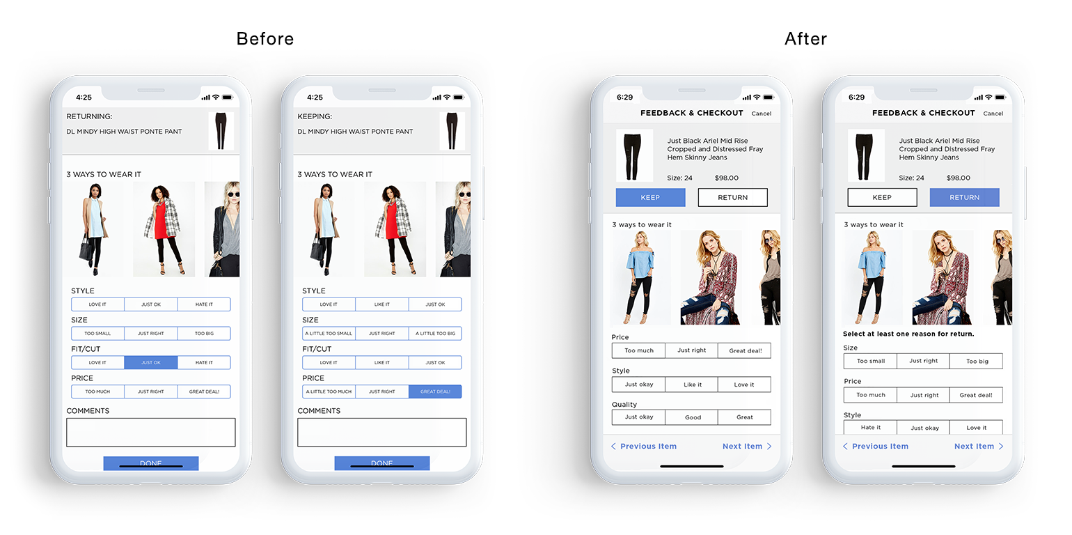
UI elements and color were updated to be more consistent with the app. When “Return” was marked, clear instructions were added so the user knew feedback was required.

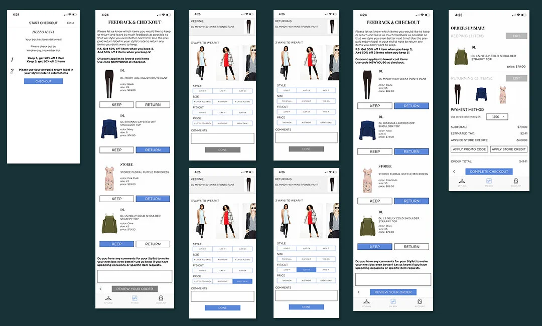
App
Major design changes were made on the app since the original experience was very different than desktop and mobile. On the app, the items would be listed out first. The user would mark “Keep” or “Return” and the feedback questions screen would slide up. In order to move onto the next item or get out of the screen, the user would need to leave at least 1 feedback and then mark “Done”. The screen would then slide down and the user would see the list of items again. Once the user completed providing feedback for all the items, they could review their order summary.
For the new process, we wanted it more streamlined and straightforward. It took three iterations with usability testing to produce the final product. I started off mocking up designs on Photoshop, which was a mistake since it took longer to create and eventually went back to pencil and paper.
Original App Design Flow

App - Iteration 1
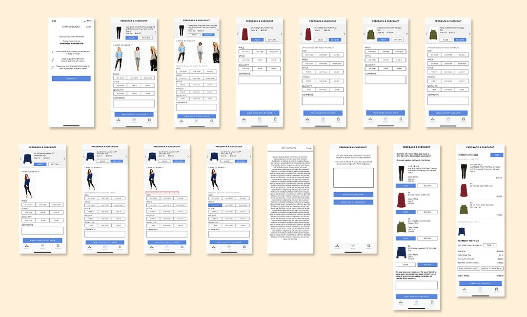
App - Iteration 2
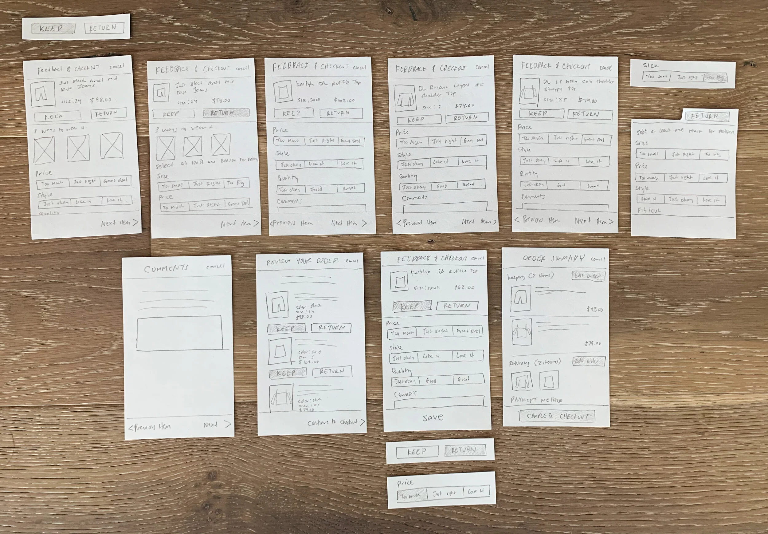
App - Iteration 3 - Paper Prototype
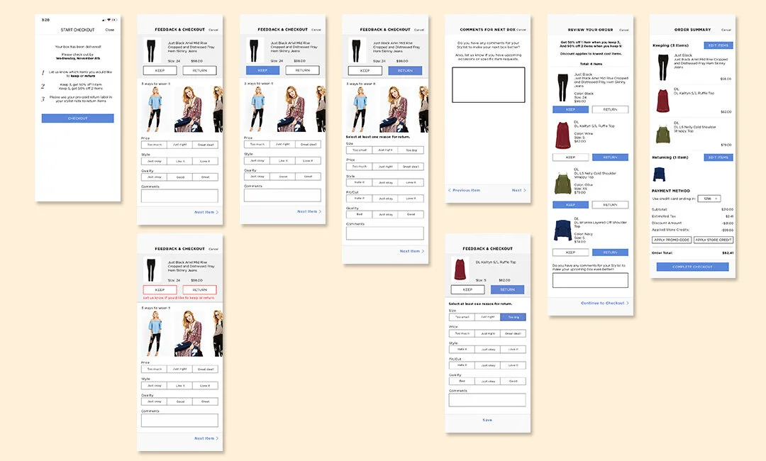
App - Iteration 3
Overall, we learned the simpler, the better. Initially, arrows were added to help the user easily navigate between items. After a couple iterations, we found that clients didn’t instantly notice the arrows. The arrows were swapped with “previous/next item” CTAs which users quickly noticed. After each iteration, we figured out how to strip down the checkout process even more like removing the footer navigation and excess screens.
UI enhancements, like increasing the button size and fonts, and visual hierarchy were made.
Conclusion
Over a span of eight weeks, the bounce rate decreased by 45% and the average time spent on the page decreased by 15% on desktop. On Mobile Web, the bounce rate decreased by 38%, however the average time on the page increased by 4%. There has been less negative sentiment about the checkout process.
Paper prototyping is key and saves a lot of time. I learned that it’s always best to keep things simple and even though more features sound nice, it overcomplicates.